Viewing File: /home/ubuntu/route-and-root-frontend-base/node_modules/react-otp-input/README.md
# react-otp-input
[](https://badge.fury.io/js/react-otp-input) [](https://www.npmjs.com/package/react-otp-input) [](https://www.npmjs.com/package/react-otp-input)
[](#contributors-)
<!-- ALL-CONTRIBUTORS-BADGE:END -->
A fully customizable, one-time password input component for the web built with React.
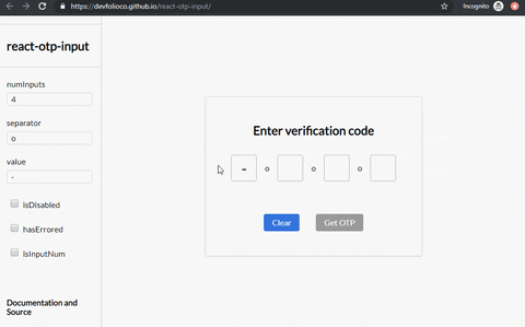
[Live Demo](https://devfolioco.github.io/react-otp-input)
[CodeSandbox](https://codesandbox.io/s/react-otp-input-demo-v2-1iy52)
## Installation
[](https://nodei.co/npm/react-otp-input/)
#### To install the latest stable version:
```
npm install --save react-otp-input
```
#### Basic usage:
```jsx
import React, { Component } from 'react';
import OtpInput from 'react-otp-input';
export default class App extends Component {
state = { otp: '' };
handleChange = (otp) => this.setState({ otp });
render() {
return (
<OtpInput
value={this.state.otp}
onChange={this.handleChange}
numInputs={6}
separator={<span>-</span>}
/>
);
}
}
```
## API
<table>
<tr>
<th>Name<br/></th>
<th>Type</th>
<th>Required</th>
<th>Default</th>
<th>Description</th>
</tr>
<tr>
<td>numInputs</td>
<td>number</td>
<td>true</td>
<td>4</td>
<td>Number of OTP inputs to be rendered.</td>
</tr>
<tr>
<td>onChange</td>
<td>function</td>
<td>true</td>
<td>console.log</td>
<td>Returns OTP code typed in inputs.</td>
</tr>
<tr>
<td>value</td>
<td>string / number</td>
<td>true</td>
<td>''</td>
<td>The value of the OTP passed into the component.</td>
</tr>
<tr>
<td>placeholder</td>
<td>string</td>
<td>false</td>
<td>none</td>
<td>Specify an expected value of each input. The length of this string should be equal to <code>numInputs</code>.</td>
</tr>
<tr>
<td>separator</td>
<td>component<br/></td>
<td>false</td>
<td>none</td>
<td>Provide a custom separator between inputs by passing a component. For instance, <code><span>-</span></code> would add <code>-</code> between each input.</td>
</tr>
<tr>
<td>containerStyle</td>
<td>style (object) / className (string)</td>
<td>false</td>
<td>none</td>
<td>Style applied or class passed to container of inputs.</td>
</tr>
<tr>
<td>inputStyle</td>
<td>style (object) / className (string)</td>
<td>false</td>
<td>none</td>
<td>Style applied or class passed to each input.</td>
</tr>
<tr>
<td>focusStyle</td>
<td>style (object) / className (string)</td>
<td>false</td>
<td>none</td>
<td>Style applied or class passed to inputs on focus.</td>
</tr>
<tr>
<td>isDisabled</td>
<td>boolean</td>
<td>false</td>
<td>false</td>
<td>Disables all the inputs.</td>
</tr>
<tr>
<td>disabledStyle</td>
<td>style (object) / className (string)</td>
<td>false</td>
<td>none</td>
<td>Style applied or class passed to each input when disabled.</td>
</tr>
<tr>
<td>hasErrored</td>
<td>boolean</td>
<td>false</td>
<td>false</td>
<td>Indicates there is an error in the inputs.</td>
</tr>
<tr>
<td>errorStyle</td>
<td>style (object) / className (string)</td>
<td>false</td>
<td>none</td>
<td>Style applied or class passed to each input when errored.</td>
</tr>
<tr>
<td>shouldAutoFocus</td>
<td>boolean</td>
<td>false</td>
<td>false</td>
<td>Auto focuses input on initial page load.</td>
</tr>
<tr>
<td>isInputNum</td>
<td>boolean</td>
<td>false</td>
<td>false</td>
<td>Restrict input to only numbers.</td>
</tr>
<tr>
<td>isInputSecure</td>
<td>boolean</td>
<td>false</td>
<td>false</td>
<td>Masks input characters.</td>
</tr>
<tr>
<td>data-cy</td>
<td>string</td>
<td>false</td>
<td>-</td>
<td>Test attribute passed to the inputs.</td>
</tr>
<tr>
<td>data-testid</td>
<td>string</td>
<td>false</td>
<td>-</td>
<td>Test attribute passed to the inputs.</td>
</tr>
</table>
## Breaking changes when porting to v1.0.0
`react-otp-input` is now a controlled component to facilitate functionalities that weren't possible before from the application using it, such as clearing or pre-assigning values. For `v1.0.0` and above, a `value` prop needs to be passed in the component for it to function as expected.
## Development
#### To run the development server:
```
npm run dev
```
## Checklist
[](https://github.com/devfolioco/react-otp-input/pulls) [](https://github.com/devfolioco/react-otp-input)
- [x] Add flowtypes
- [x] Add ESLint, Prettier for code quality
- [x] Add styling support for states including focus/disabled
- [ ] Write tests
## Contributing
[](https://github.com/devfolioco/react-otp-input/issues) [](https://github.com/devfolioco/react-otp-input/pulls)
Feel free to open [issues](https://github.com/devfolioco/react-otp-input/issues/new/choose) and [pull requests](https://github.com/devfolioco/react-otp-input/pulls)!
## License
[](https://github.com/devfolioco/react-otp-input/blob/master/LICENSE)
## Contributors ✨
Thanks goes to these wonderful people ([emoji key](https://allcontributors.org/docs/en/emoji-key)):
<!-- ALL-CONTRIBUTORS-LIST:START - Do not remove or modify this section -->
<!-- prettier-ignore-start -->
<!-- markdownlint-disable -->
<table>
<tr>
<td align="center"><a href="https://github.com/apollonian"><img src="https://avatars2.githubusercontent.com/u/2150306?v=4" width="100px;" alt=""/><br /><sub><b>Abhishek Warokar</b></sub></a><br /><a href="https://github.com/devfolioco/react-otp-input/commits?author=apollonian" title="Code">💻</a> <a href="#design-apollonian" title="Design">🎨</a> <a href="#maintenance-apollonian" title="Maintenance">🚧</a> <a href="#ideas-apollonian" title="Ideas, Planning, & Feedback">🤔</a> <a href="https://github.com/devfolioco/react-otp-input/pulls?q=is%3Apr+reviewed-by%3Aapollonian" title="Reviewed Pull Requests">👀</a></td>
<td align="center"><a href="https://ajayns.me"><img src="https://avatars0.githubusercontent.com/u/20743219?v=4" width="100px;" alt=""/><br /><sub><b>Aj</b></sub></a><br /><a href="https://github.com/devfolioco/react-otp-input/commits?author=ajayns" title="Code">💻</a> <a href="#design-ajayns" title="Design">🎨</a> <a href="#ideas-ajayns" title="Ideas, Planning, & Feedback">🤔</a></td>
<td align="center"><a href="http://aromalanil.me"><img src="https://avatars1.githubusercontent.com/u/49222186?v=4" width="100px;" alt=""/><br /><sub><b>Aromal Anil</b></sub></a><br /><a href="https://github.com/devfolioco/react-otp-input/commits?author=aromalanil" title="Code">💻</a> <a href="#tool-aromalanil" title="Tools">🔧</a></td>
<td align="center"><a href="https://borntofrappe.github.io"><img src="https://avatars0.githubusercontent.com/u/33316703?v=4" width="100px;" alt=""/><br /><sub><b>Gabriele Corti</b></sub></a><br /><a href="https://github.com/devfolioco/react-otp-input/commits?author=borntofrappe" title="Code">💻</a> <a href="#a11y-borntofrappe" title="Accessibility">️️️️♿️</a></td>
<td align="center"><a href="https://www.anoopms.me"><img src="https://avatars1.githubusercontent.com/u/46913894?v=4" width="100px;" alt=""/><br /><sub><b>Anoop</b></sub></a><br /><a href="https://github.com/devfolioco/react-otp-input/commits?author=anoopmsivadas" title="Code">💻</a></td>
<td align="center"><a href="http://dewanshrawat.xyz"><img src="https://avatars0.githubusercontent.com/u/17003127?v=4" width="100px;" alt=""/><br /><sub><b>Dewansh Rawat</b></sub></a><br /><a href="https://github.com/devfolioco/react-otp-input/issues?q=author%3Adewanshrawat15" title="Bug reports">🐛</a></td>
<td align="center"><a href="http://ishanchhabra.com"><img src="https://avatars3.githubusercontent.com/u/32290367?v=4" width="100px;" alt=""/><br /><sub><b>Ishan Chhabra</b></sub></a><br /><a href="https://github.com/devfolioco/react-otp-input/commits?author=ishan-chhabra" title="Code">💻</a></td>
</tr>
</table>
<!-- markdownlint-enable -->
<!-- prettier-ignore-end -->
<!-- ALL-CONTRIBUTORS-LIST:END -->
This project follows the [all-contributors](https://github.com/all-contributors/all-contributors) specification. Contributions of any kind welcome!
Back to Directory
File Manager